
A course can be finished by every learner on the roster and still fail. The completion report is green and the quiz scores are fine. Three weeks later, people on the job are doing the task the old way, or not doing it at all. That is the failure this article is about, and it is a different one from a course nobody finishes.
We build interactive learning for clients, so we have a view, and we say below where something is our view and where it is evidence. The evidence is thinner than the topic deserves. There is solid public data on completion in open online courses and on how memory fades. We do not have a source for how often workplace e-learning fails overall, so this article does not claim a rate.
Start With a 60-Second Lesson
Before the argument, here is what we mean by interactive. This is a 60-second demo lesson from Sphere Academy, our own interactive learning product. It teaches one idea from game development, how an object's position, rotation and scale work, and it asks the learner to try things instead of only reading about them.
In the demo, the learner drags sliders to see each value change an object, moves a cube onto a glowing pad, types a line of code and sees the result, then matches a target in a challenge.
Watch for the moments where the learner acts and the lesson responds, as in the cube task and the code step. The rest of this article is about why that matters, and where courses that skip it go wrong.
Two Ways a Course Fails
- Nobody finishes. Learners start, drift away and never return. This shows up in the data.
- Everybody finishes and nothing changes. Learners click through, pass a quiz and forget it. This is harder to see, because every report says the course worked.
The two have different causes, and interaction design addresses both. It does so by deciding what a learner has to do, not only what they have to read.
What the Evidence Says
Completion Is Often Low
The most useful public dataset we found is Katy Jordan's 2015 analysis of enrolment and completion data from 221 massive open online courses. Completion, defined as the share of enrolled students who completed the course, ranged from 0.7% to 52.1%, with a median of 12.6%.
Two cautions apply. These are open online courses that anyone can join, not workplace training, so the median is not a figure for your company. And the paper reports associations across courses, not a test of any design change. Within those limits, the pattern is worth reading: longer courses had lower completion, courses graded only by automatic marking had higher completion, and in the sub-sample with activity data, the first two weeks appeared critical, with active use leveling off after that.
Memory Fades Without Use
In 2015, Jaap Murre and Joeri Dros replicated Hermann Ebbinghaus's 1880 forgetting curve. They had one participant learn lists of nonsense syllables and relearn them after delays from 20 minutes to 31 days, and concluded that the curve had indeed been replicated.
That is one person memorizing meaningless syllables, so it does not tell you how much a forklift operator keeps from a safety module. What it supports is the general point that unused material fades. A single pass through a course is not a plan for retention. A course that never asks the learner to use what they learned gives memory nothing to hold on to.
Where E-Learning Goes Wrong
The four patterns below are our view, drawn from building and reviewing training. The first three are about what the course asks of the learner. The fourth is about what it measures.
Interaction That Is Only Navigation
A course with a Next button, a few hotspots and a quiz at the end is often called interactive learning. It is interactive in the way a page turn is interactive. The learner's choices do not change what happens next, so there is nothing to think about and nothing to remember. Real interactivity means a different decision leads to a different outcome.
Content Without Structure
Richard Mayer's multimedia learning research is a common reference for how to present material. In a 2019 summary of it, Lisa Hammershaimb lists principles that are easy to check a course against:
- Coherence. Leave out words, pictures and sounds that do not serve the lesson.
- Signaling. Use headings and other cues so learners can see how the material is organized.
- Segmenting. Break the lesson into smaller, learner-paced pieces.
- Redundancy. Do not read out the same words that are on screen.
A course that fails these is hard to follow before it has taught anything. Fixing them is interaction design in the plain sense: deciding what appears, in what order, at whose pace.
No Practice and No Consequences
Most jobs are decisions made under conditions, not facts recalled on request. Scenario-based learning puts the learner in a situation, asks for a choice and shows the result. The value is in the consequence. A learner who picks the wrong option and sees why it was wrong has learned something a bullet point cannot teach.
Measuring Completion Instead of Performance
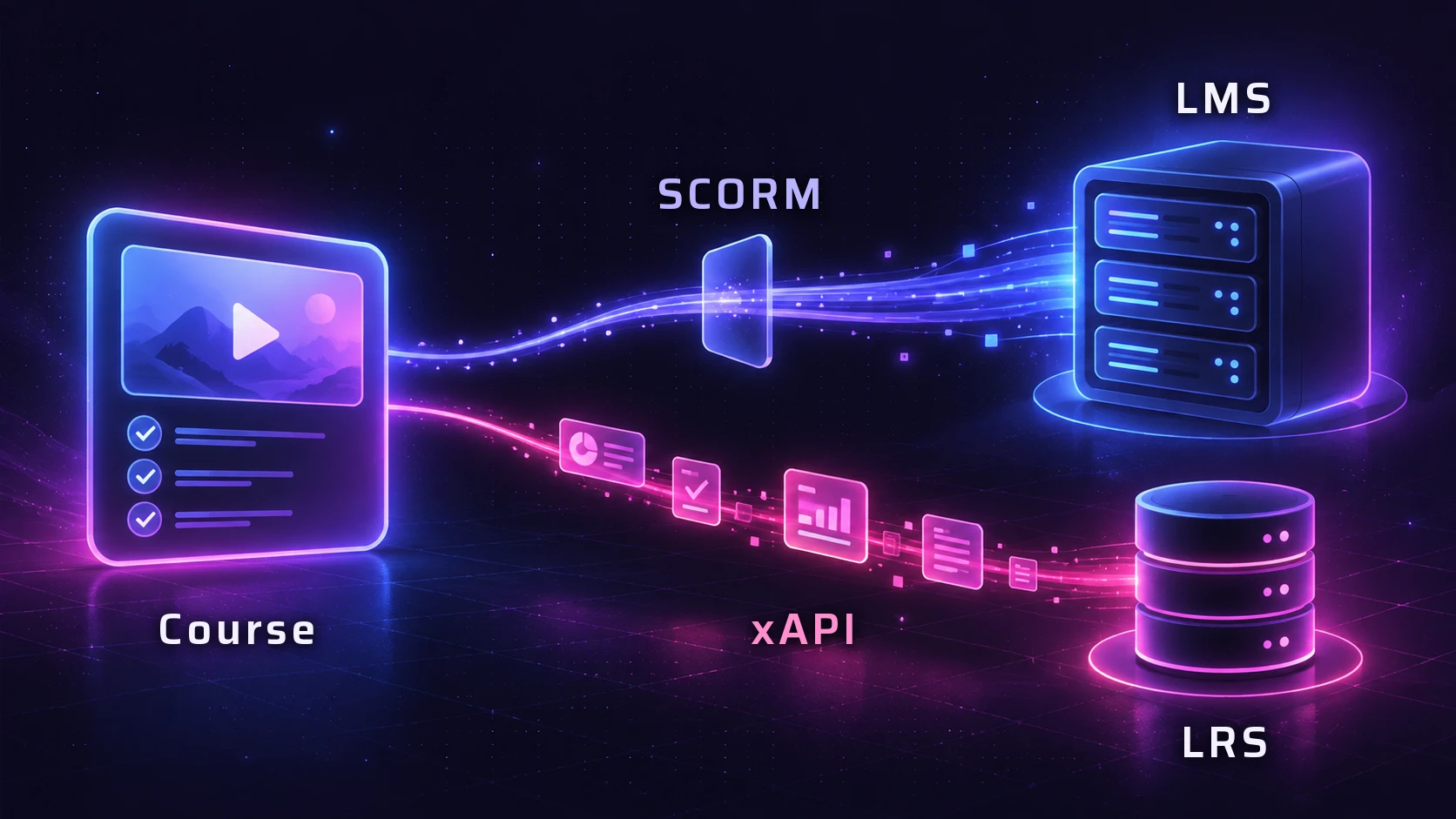
Completion and performance answer different questions. Our glossary entry on progress tracking makes the point: knowing that someone finished most of a course does not tell you whether they improved. If the only thing a course reports is that someone reached the end, nobody can tell this failure from success. We cover what each reporting standard can and cannot record in SCORM and xAPI Explained.
What Interaction Design Changes
Each failure above has a matching design response. This table is a way to review a course, yours or a vendor's.
| Failure | Design response | What to look for |
|---|---|---|
| Click-through navigation | Decisions the learner must make | Choices that lead to different outcomes |
| Unstructured content | Short segments with clear cues | One idea per segment, no filler |
| No practice or consequence | Scenarios with feedback and retry | Wrong choices that show why they were wrong |
| Forgetting after one pass | Return to key skills later in the course | Earlier decisions that reappear in new situations |
| Completion as the only metric | Reporting on what learners did | Decision-level data, not only pass or fail |
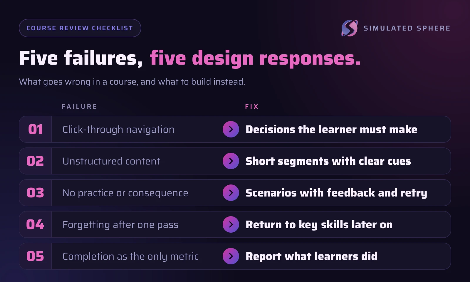
The fourth row is our design practice rather than something the studies above test. It follows from the point that unused material fades, and it costs little to build in.
An Illustrative Example
This example is hypothetical, not a client project. Take a course on operating a high-pressure machine.
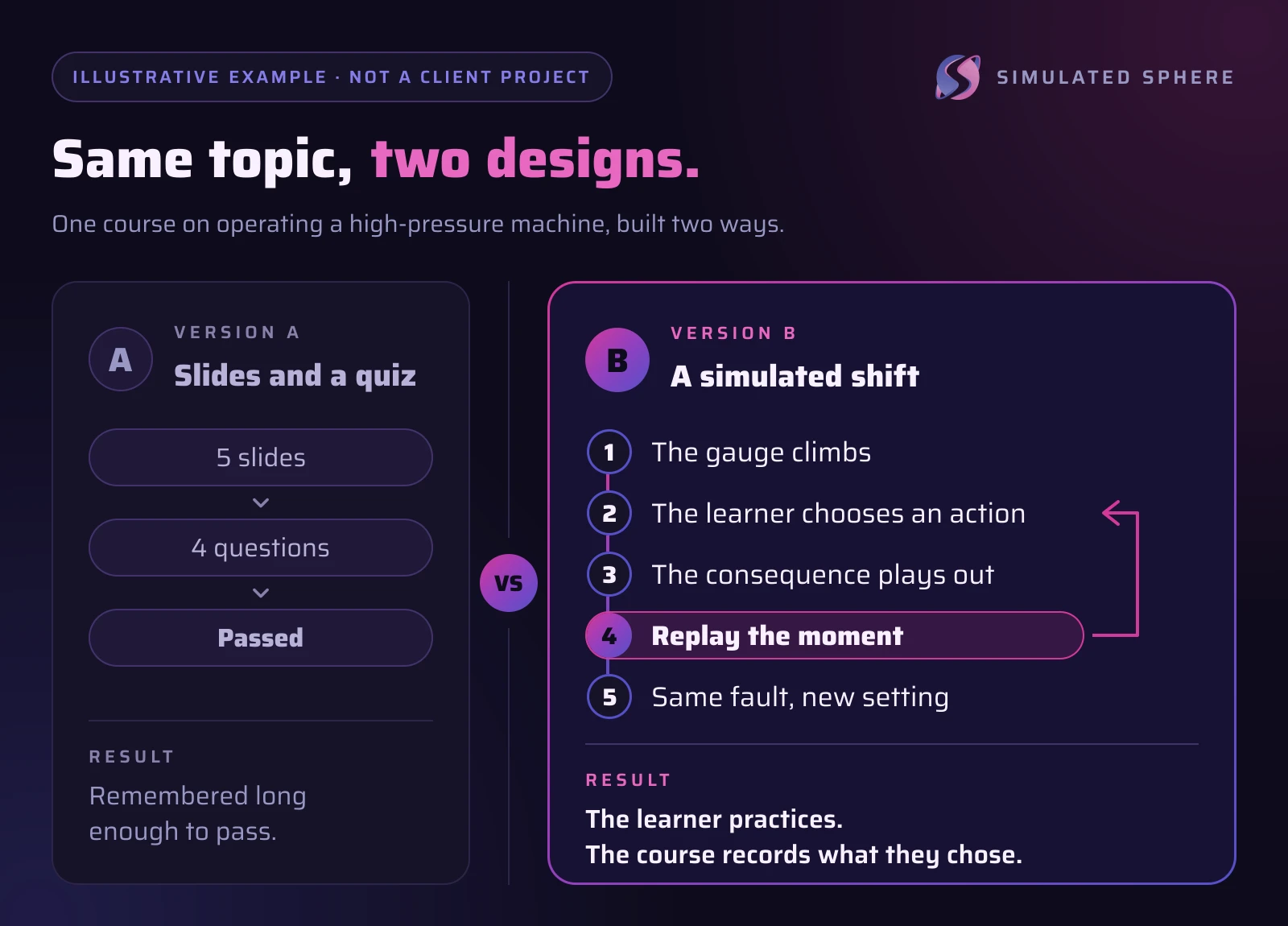
Version A. Five slides explain what the pressure gauge shows and what to do if the reading is abnormal. A four-question quiz follows. The learner passes by remembering the right answers for ten minutes.
Version B. The learner starts a simulated shift. The gauge climbs and they pick an action. If they pick an unsafe one, they see what happens, then replay the moment. Later in the same course, the same fault appears in a different setting, and the course records which choices they made.
Version B takes longer to design and build. It also gives the learner something to practice and gives the organization something better than a pass mark. Whether it is worth the cost depends on what a mistake on that machine costs.
What Interaction Design Cannot Fix
Design does not rescue a course with unclear goals, content nobody needs, or learners who have no time to take it. It is also not the same as adding points and badges. As our glossary says of gamification, it can help with engagement but cannot replace good content or clear learning goals. Interaction costs more than slides, and for plain facts a short, focused format may serve better.
A Checklist Before You Commission a Course
- Can you state what a learner should be able to do afterward, in one sentence?
- Does the learner make decisions, and do different decisions produce different results?
- Is the material in short segments, with nothing that does not serve the goal?
- Does a wrong choice show why it was wrong, and can the learner retry?
- Do key skills come back later in new situations?
- Will the course report performance, and can your LMS or record store receive it?
Frequently Asked Questions
We do not have a source for a figure, so we will not give one. The public data we found covers open online courses, where completion is often low. What we can say from experience is that courses built around navigation and a final quiz tend to produce completion reports that look better than the learning behind them.
Usually, yes. Scenarios take more design and build time than slides. The question is what the skill is worth. For a task where a mistake is costly or dangerous, practice is often what you are paying for.
Not always. In Jordan's data, longer courses had lower completion, but that is an association across open online courses. Length should follow the goal. Cutting content that does not serve it is a separate decision from cutting the course.
Completion will not tell you. Look at performance inside the course, such as which decisions learners made, and at what happens on the job afterward. Decide before the course is built which of those you will measure.
Sources
- Massive Open Online Course Completion Rates Revisited: Assessment, Length and AttritionInternational Review of Research in Open and Distributed Learning
- Replication and Analysis of Ebbinghaus' Forgetting CurvePLOS ONE
- Designing Online Learning Spaces (3): A Picture Is Worth a Thousand Words? A Summary of Mayer's 12 Principles of Multimedia LearningAACE Review
Want training that changes what people do?
We design interactive lessons and scenarios for clients. Tell us the skill and what you need to measure, and we will plan the course around it.